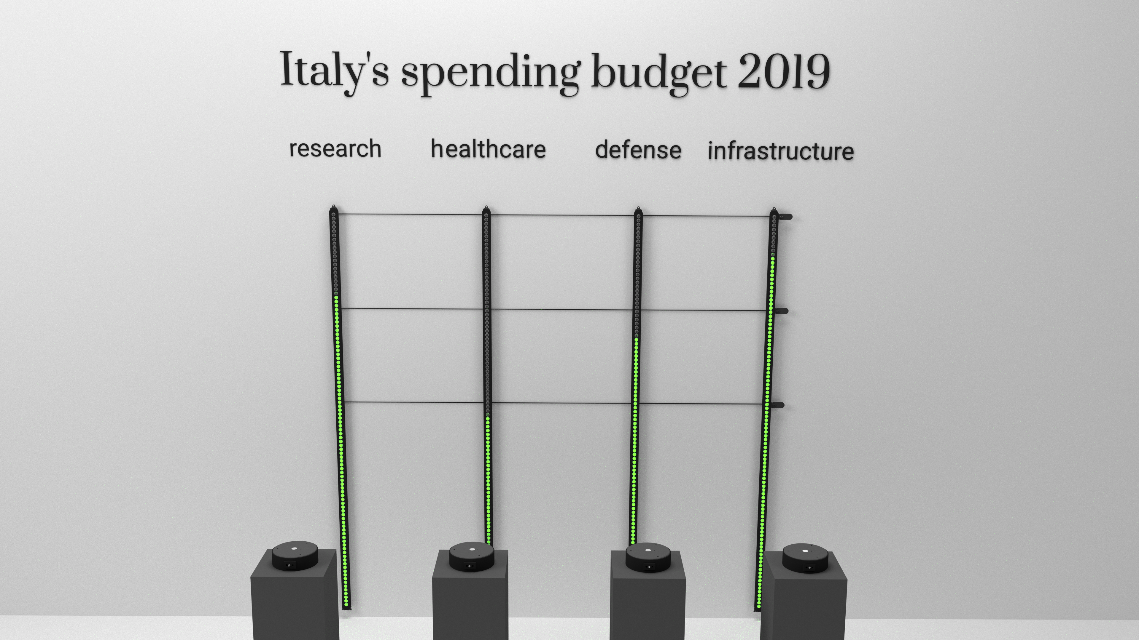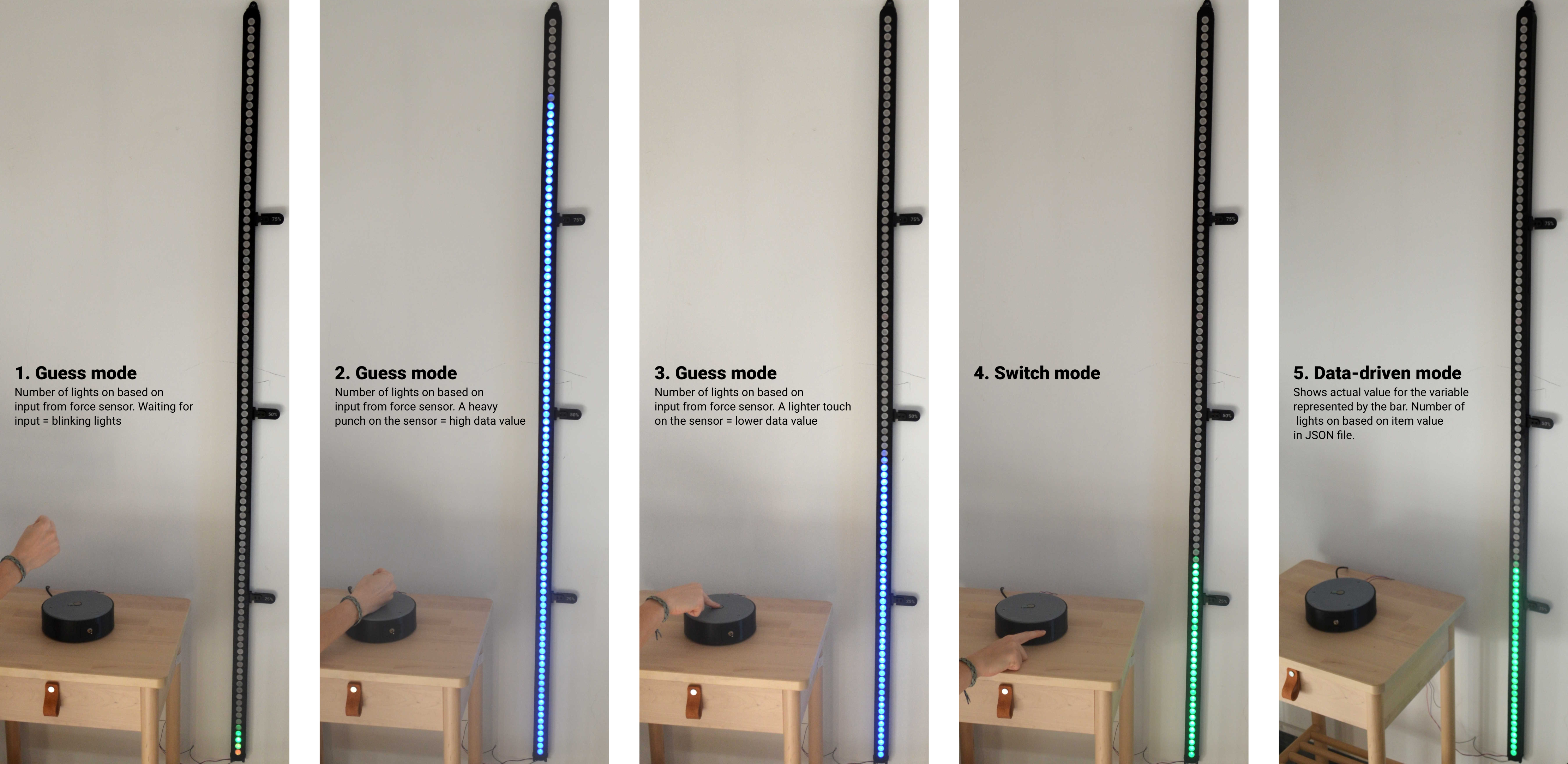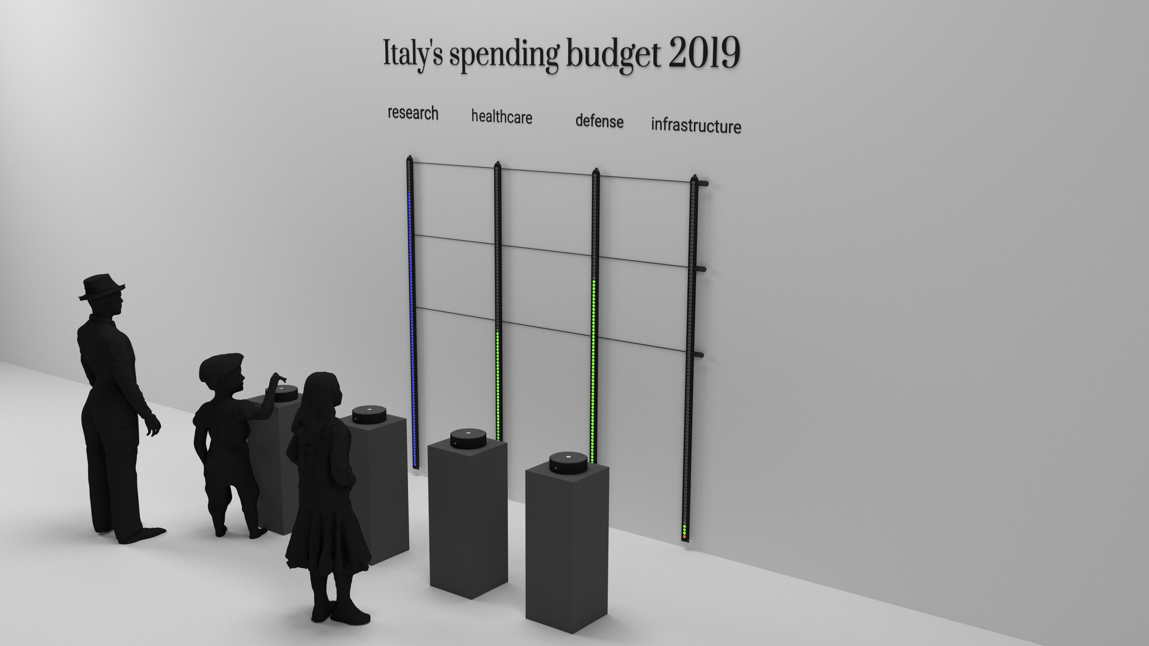
Otherwise, the user could move onto the next bar and try to guess the amount of following variable, switching to the actual results for all the bars at the end. In the process, the user is also grasping a general feel of quantities through a non-visual sense, while also being surprised by how close or far its guesses are. The installation is useful to convey magnitudes and could be advantageously used for dataset where the metaphors of weight and pressure make sense. For example, it could be used to communicate budget distributions, where the effort it takes to light up a specific bar/variable metaphorically represents the tax effort required to cover such costs.
Possible variations
The installation’s interactivity is driven by an Arduino microcontroller and it is therefore easy for a programmer familiar with the language to add more features and customize the interaction and colors by editing existing variables or adding additional code snippets. One first variation could be to have a single matrix, instead of multiple bars, with several pressure sensors for input, one for each variable. In this scenario, the user’s guesses for each variable would be mapped in the same LED matrix, resulting in something similar to a waffle chart or treemap, rather than a bar chart. Another option is to modify the Arduino code so that it saves each user’s input on a SD. The user inputs could then be integrated on a follow-up piece comparing the “crowd’s” expectations to the actual dataset. An interesting feature of using programmable LEDs to work with data is that the LED behavior can be used to communicate ambiguity or uncertainty in data, for example by having the LEDs blink at different frequencies. Additionally, it is quite easy to adapt the design and code so that it works with other types of sensors and hand gestures, to harness different modalities and metaphors: temperature sensors, motion sensors, etc. Disclaimer: data in the render image is dummy data, solely made up for demo purposes.